Showing posts with label Trends. Show all posts

New Spring Collections From B&Q to Fall in Love With.


Images B&Q 

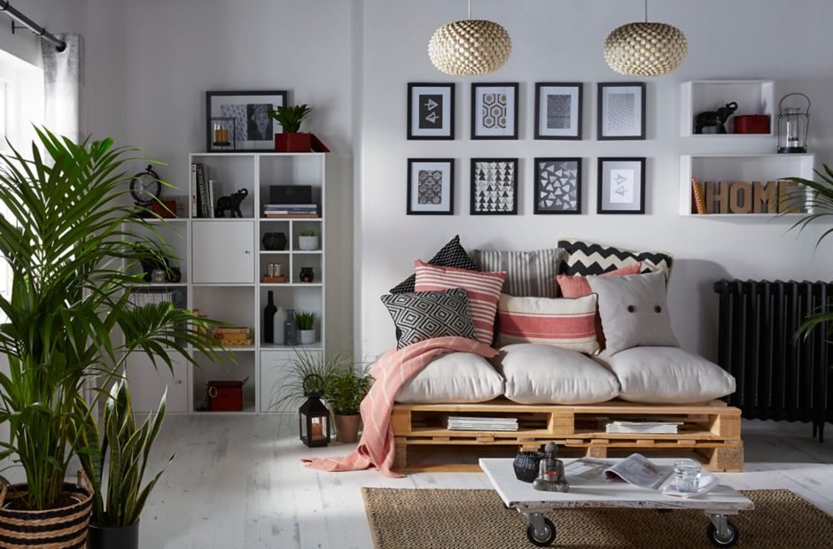
Last week we popped into our local B&Q for some light bulbs, (you'd think that an easy task, but have you seen light bulb aisles lately? thankfully a member of staff pointed me in the right direction) and as always I couldn't help but wonder around the aisles as you do, to see what's new. Needless to say, I left with an arm full of wallpaper samples (see which one I took a shine to on my Instagram feed) as the new spring collections are starting to filter into the stores, and I have to say I'm impressed with what's on offer, I'm loving the pastel shade and chevron accessories from the Summer Daze collection, (tops set of photos) but also love the nordic inspired look available in the Kasbah collection. There are two other collections in the series also, Meadow, which is all about bringing the outdoors in, and A Touch Of Luxe inspired by golds and metallics. Which is your favourite Look?


Interior Colour Trends 2016.

Dulux recently published their colour trend for 2016, under the title of Looking Both Ways, (see video here) and identifying the colour of the year as Ochre, a golden yellow tone.  Along with this, four other key trends were  identified  'Heritage and Future, Words and Pictures, Dark and light, and The Grid and letting go' all of which work with the colour of the year.


Heritage and Future
Heritage and Future, probably the most comforting trend,  is about  taking inspiration from the past, and appreciating the history, authenticity and credibility of our rich heritage. You know what you are getting, but to create a future you have to reinvent it, perhaps using traditional crafts but putting a spin on it, using colour in unexpected ways, or blending traditional and modern.
Translated into colours we see a mix of rich   reds that reflect our rich heritage, but also have a bright contemporary feel that points to the future.


Words and pictures
They say if you hold on to something long enough it will come back into fashion, and somehow we appreciate it even more, I think because it then becomes sentimental to us, enveloped in our own memories, for instance, there's something special about a shelf full of vinyl records, don't you think?  Today's digital technology is moving at such a fast pace where words are exchanged for emoticons and abbreviations that we are currently seeing a new found power   and increased interest in words and lettering in interior design.  The colour palette for words and pictures  uses the blue of ink and grey of graphite seen in the printed page, which helps to create a sense of calm in an otherwise busy world of colour saturated  graphics. 


Dark and Light
Probably my least favourite trend because I love the light is Dark and Light, but in this world where everything is switched on 24/7 it is becoming increasingly important to create dark in order for our biological health, constant light disrupts our sleep pattern, Earth Hour has highlighted how much light pollution effects us all, you can never really appreciate a starry night in the city, so to appreciate the light you must first appreciate the dark. The colours in this trend draw its inspiration from both dusk and dawn during the golden hour.


All Images by Dulux
The Grid and Letting go.
This trend is probably my favourite of the four, it feels young and fresh and fun.   This trend is all about experimenting and letting your imagination run a little riot, breaking free from the day to day boundaries and going off grid so to speak to discover new things about yourself, while still having the safety of the norm.   The colours in this palette are vivid and playful, yet still held back by the black and white of the grid.


What do you think, can you relate to any of these trends? To see the full-colour trend report visit Dulux  Colour of the Year, which trend is your favourite? 

An Interview with Illustrator Abi Overland


All images by kind permission of Abi Overland Photography by  Max Burnett 

This story actually began some months back, when I bought a drawing of a stag's head from a pop-up shop selling artwork by local artists in St. Helier, which I blogged about it here. Unfortunately, the piece was unsigned so I couldn't find out any more about it or the artist, (I like to google stuff when I find something I like to check out what else is available). Fast forward to September of this year, and I happened to be wandering around the stalls of a local Arts and Music Festival called Spice, where I spotted some familiar work, and was delighted to find the artist behind the art, Abi Overland. Since then I have been following her on social media, and watching with interest how she has developed as an artist and progressed to starting her own business,  and I'm very pleased to have Abi as  my blog guest today.  So a very big welcome to Abi Overland..

1.Would you mind telling us a little about yourself, and what you do.
I'm an illustrator by trade! I graduated last year with a degree in illustrations from the university of Brighton.


2. What are your tools of your trade?
I generally favour my drawing pens, being a lefty makes it a bit of a nightmare drawing with pencils and usually end up with a nice blurred drawing and a metallic arm!


3. Have you always had an interest in art/drawing/illustrations? 
Always, when I was small and couldn't draw, I used to make my parents draw me pictures and I'd watch how they did it.  My godmother is a fashion designer and she was my hero! She drew me loads of pictures of ladies in amazing dresses.  There was never any other option, my life was always going to be drawing.

4.  So how did it feel when you were contacted by Vogue magazine?
I was at work and it was a particularly crap days o it completely knocked the wind out of me, I then proceeded to spend the rest of the day jumping up and down. When starting your own business its's quite hard sometimes to stop the doubt creeping in and panicking about it being successful, especially when it's something personal, so having Vogue on side is a huge boost.


5. You've worked with a few local companies, The Gallery Magazine, and Bean around the world, who b what have you got in your sights next, (If it's not a trade secret and telling me would involve having to kill me)
I would like to get involved with more local companies and maybe do collaborations with other creatives in Jersey, I haven't got anything planned yet but have got big ideas in the pipeline for this coming year.


6. You started off with drawing and illustrations, why the move to ceramics?
I wanted to have a medium that would transform my illustrations into  useable items and I spent a while looking into what exactly I wanted to do with them, how I wanted to do it and managed to source a factory in Stoke-on -Trent that specialised in short run productions of fine bone china and it all fell perfectly into place.  since then I've developed a real passion and appreciation for ceramics and have started to experiment with clay sculptures too. Just for fun.


7. Will you also carry on with drawings?
Oh, of course, I'm still constantly drawing. I get withdrawal symptoms if I stop for too long!


All images by kind permission of Abi Overland Photography by  Max Burnett 

8. How did you find the whole process of starting your own business? And any tips you could offer to anyone thinking of taking the leap.
I found it a really enjoyable process, I’ve taken my time over each step to make sure it is perfect and it took longer than I expected, but that was always going to be the case. It’s scary at times, but I wouldn’t have it any other way, the fear makes you productive.
I think the best advice I could give anyone is that when you start your own business you need to give yourself a lot of time to daydream and come up with outlandish and fantastical ideas. Realistically most of these won’t be able to come to fruition, but what you’ll find from doing this is that you’ll research and look into possibilities that initially you wouldn’t have thought possible and that’s where you get the best results. 
Also, if you want to do something, you’ve just got to get out there and start doing it, you’ve got to look at where you want to be and what steps you need to take to get there.

9. If you could have any chef in the world create a plate of food that could sum up the essence of Abi overland design, who would it be, and what outrageous dish do you think they should make?
It would have to be someone equally outrageous, El Bulli for instance! Something with a burst of colour in it would look fabulous.


10 Where can we buy your stuff.
Currently online on my website www.abioverland.com, but I will be making an appearance in a variety of markets and events too.

11. and finally, you know that stags head that I bought? would you mind signing it for me, please. :-)

Of course! Let me know when where you want to arrange it and I'll sign it for you!'


And if you happen to be in Jersey on the 28/29 of November, Abi will have a stall at the Simply Christmas Market Set in the unique location of Greve de Lecq Barracks with free parking & free entry.


All images by kind permission of Abi Overland Photography by  Max Burnett 

Trend: The Industrial Look


Who ever would have thought that dilapidated premises and warehouses would become highly coveted residential properties? Retaining their rough, unfinished charm, exposed concrete, visible pipes and brick walls are being used to give these spaces a robust yet authentic look. Indeed, the industrial trend embraces imperfection: unpolished interiors that exude character with every turn, and Quick-Step is the latest manufacturer to help introduce this feel to the home.


Industrial interiors needn’t seem cold; with the right furnishing you can create the cosiest of home spaces, whether you are recreating in a former warehouse, cool loft or perhaps more traditional environment. Accent walls and copper accessories can easily warm up the chilly atmosphere of such buildings, exposed red brick an additional bonus found in locations of this type.


Designers and architects have come to recognise the beauty of concrete and are using it more and more frequently. Quick-Step has responded to this with the industrial look and feel of Impressive ‘Concrete Wood Light Grey’, wood-look planks treated with a concrete effect for that highly desirable rough edge. Quick-Step has a solution for a full-scale concrete look, too: ‘Polished Concrete’ from Arte creates a smoother, more neutral feel, giving your interior a bright and spacious atmosphere like few other laminates can achieve.

This post was brought to you by Quick-step.co.uk

Trend: Black Woodgrain Kitchens

I'm seeing a lot of black kitchens lately, from uber modern and very sleek, to raw and handmade. For me, what I love about them is the grain in the wood, and how it somehow stands out more when painted in black, wheater it be a high-end wood smoothed to perfection or a piece of  the cheapest Ply totally transformed, it keeps you connected to the origins of the material, wood in all its glory. 

The key to this look is to keep it simple, don't introduce too many other colours and materials, otherwise it will look  overpowering, I've seen people paint entire kitchens black and personally I think its overkill. Unless you have the height space and light in the room, I would stick to lower cabinets in black.  Simple lines work best. 
My favourite has to be the first one though I love the lighting arrangement in the last photo.  Would you consider a black kitchen.?

Industrial mix with traditional.

Uber sleek Kitchen and modern

Clean lines

Raw industrial kitchen.